Did you know that nearly 70% of custom apparel orders experience production delays or quality issues simply because of avoidable design errors? It’s a staggering number that represents a lot of wasted time, frustrated marketing managers, and spent budget for businesses just like yours. When you’re putting your brand on a trucker hat, you want it to look sharp, feel comfortable, and actually get worn by your customers or team, right? So, why do so many people end up with a box of hats that nobody wants to wear? Is it possible that a few small oversights are standing between you and the perfect custom headwear?
At Seven Clay, we’ve seen it all. From logos that are so small they disappear into the mesh to hats that are so tall they look like they’re trying to touch the clouds, we know where the pitfalls lie. This is where the fun begins! We want to make sure your next batch of custom trucker hats is a total home run. By understanding these seven common mistakes, you can move from “just okay” to “wow, where did you get that hat?” Are you ready to level up your brand’s headwear game?
1. Trying to Fit the “Kitchen Sink” into Your Logo
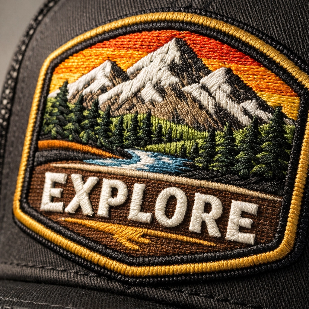
First things first: simplicity is your best friend when it comes to headwear. One of the biggest mistakes we see is a business trying to take a complex, multi-layered digital illustration and cram it onto a 2.5-inch patch. While high-definition printing is cool, traditional embroidery and even leather patches have physical limits. When you have ultra-fine lines or tiny “hairline” text, the thread or the laser simply can’t capture that level of detail without it looking like a cluttered mess. This is especially true for the rugged texture of a trucker hat, where the fabric needs room to breathe.
– If your logo has a long slogan in a tiny font, consider dropping the text for the hat version.
– Focus on your primary icon or a bold version of your brand name to ensure it’s readable from across the room.
– Remember that less is usually more; a minimalist vibe often feels more premium and trendy anyway.
Does your current logo look like it would still be recognizable if you shrunk it down to the size of a postage stamp? If the answer is no, it might be time to simplify before you hit the “order” button on your next batch of caps.

2. Picking the Wrong Crown Profile for Your Audience
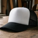
Did you realize that not all trucker hats are shaped the same? This is where a lot of brands go off the rails. You might love the look of a classic high-crown foam trucker hat because it has that vintage, retro vibe. However, if your target audience prefers a more modern, laid-back athletic look, that high-profile hat is going to feel awkward and bulky on their heads. On the flip side, a low-profile hat might feel too small for people who are used to the structured feel of a traditional snapback.
– High-crown hats are bold and provide a large “billboard” space for your logo, but they don’t fit everyone’s head shape well.
– Mid-profile hats are the “Goldilocks” of the industry: they fit almost everyone and offer a balanced look.
– Low-profile hats are great for a more “dad hat” feel but can sometimes make a trucker mesh look a bit disproportionate.
We always recommend checking out our guide on the construction of a cap to see which silhouette matches your brand’s personality. Are you going for a rugged outdoorsy look or a sleek, urban professional vibe? Choosing the right profile is the foundation of a hat people will actually wear.
3. Using Low-Resolution Art Files
We know it’s tempting to just grab a JPEG off your website and send it over, but that is a recipe for a blurry disaster. When we take a low-resolution file and try to scale it up for a patch or embroidery, the edges become jagged and “pixelated.” This makes it incredibly difficult for our designers to create a clean “digitized” file for the embroidery machines. If the source material is bad, the final product will be too. It’s like trying to bake a gourmet cake with expired ingredients: it just doesn’t work!
– Always try to provide vector files (think .AI, .EPS, or .PDF) whenever possible.
– If you only have a raster file (like a .PNG), make sure it is high-resolution (at least 300 DPI) and has a transparent background.
– Avoid sending screenshots of your logo from your phone, as these lose quality instantly.
Investing the time to find your original brand files will save you a massive headache later. If you’re struggling with your design, you can always check out our view design page to see examples of what high-quality branding looks like. Isn’t your brand worth the extra five minutes of searching for the right file?
4. Mismatching Your Logo with the Decoration Method
Not every logo is built for every decoration style. For example, if your logo has a lot of color gradients and shadows, a standard 3D puff embroidery is going to be almost impossible to pull off correctly. Conversely, if you want a rugged, heirloom look, a simple screen-printed logo on the front might feel a bit “cheap” compared to a custom leather patch. You have to match the vibe of your design with the physical way it’s applied to the hat.
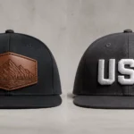
– Leather patches are perfect for outdoor brands and offer a timeless, high-end feel.
– Flat embroidery is classic and durable, making it great for everyday workwear.
– Sublimated patches allow for full-color, high-detail photos and complex gradients if that’s your brand’s style.
We’ve written extensively about decorating a trucker cap so you can make an informed choice. Why settle for a decoration method that clashes with your aesthetic when you could have something that perfectly complements your brand’s story?

5. Skipping the Physical Sample or Prototyping Phase
In a world of fast shipping and instant gratification, it’s easy to want to skip straight to the bulk order. But skipping a sample is one of the biggest risks you can take. Colors on a computer screen often look different than thread colors in real life. The “feel” of the mesh or the stiffness of the buckram can’t be felt through a PDF mockup. If you’re ordering hundreds of hats for an event, you don’t want to find out the orange is actually “neon peach” once the boxes arrive at your door.
– Always ask for a digital “sew-out” or a physical sample if you’re doing a large run.
– Test the hat yourself to make sure the fit is exactly what you expected.
– Pay attention to the small details, like the color of the plastic snapback closure or the under-visor color.
We stand behind our work with a guarantee, but we always feel better when our customers have seen exactly what they’re getting. Isn’t it better to spend a few extra days on a sample than to have a thousand hats you aren’t happy with?
6. Forgetting the “Comfort Factor”
A hat can look like a masterpiece, but if it feels like wearing a cardboard box, it’s going straight to the back of the closet. Trucker hats are known for their mesh backs, which provide great ventilation, but the quality of that mesh matters. Some mesh is stiff and scratchy, while other styles are soft and flexible. Similarly, the sweatband on the inside is the only part touching the wearer’s skin: if it’s made of cheap, non-absorbent material, it’s going to be uncomfortable within twenty minutes.
– Look for “soft mesh” options if your audience is looking for a more relaxed, comfortable fit.
– Consider the weight of the front panel fabric; cotton twill is breathable, while some synthetic blends offer better moisture-wicking.
– Make sure the adjustable strap is high-quality so it doesn’t snap or become brittle over time.
Think about your favorite hat. Why do you wear it? It’s probably because it fits perfectly and feels like you’ve owned it for years. That’s the feeling we want to recreate for your customers. Have you considered how the physical materials of your hat will feel after a long day in the Texas sun?

7. Messing Up the Scaling and Symmetry
Placement is everything. A logo that is just half an inch too high can make the wearer look like they have a very tall forehead. A logo that is too low can get “swallowed” by the curve of the bill. Worse yet, if the logo isn’t centered perfectly, the entire hat will look “off,” even if the embroidery itself is beautiful. Scaling is also a major factor: a tiny logo on a massive high-crown hat looks lost, while a giant logo on a low-profile hat can overwhelm the design.
– Stick to the “golden ratio” for hat logos, usually around 2.25 to 2.5 inches in height.
– Ensure your design is perfectly centered between the vertical seams of the front panels.
– Consider side-logo placement for a more “pro” look, but don’t overdo it with too many locations.
At Seven Clay, we help you find that “sweet spot” where your logo looks intentional and professional. If you’re unsure about the layout, you can always reach out through our contact page for some expert advice. Why guess on the placement when you can rely on pros who do this every single day?
Let’s Build Your Perfect Hat Together
Avoiding these seven mistakes will put you miles ahead of the competition and ensure your custom trucker hats are the ones people reach for every single morning. We believe that custom gear should be a source of pride for your business, not a source of stress. Whether you’re looking for a small batch for a local event or a massive rollout for a national brand, we’re here to make the process as smooth as possible.
– We provide expert design feedback to ensure your art is production-ready.
– Our team helps you select the perfect hat profile for your specific audience.
– We offer a variety of high-end decoration methods, from classic embroidery to custom leather patches.
– You get the peace of mind that comes with working with a Texas-based team that cares about quality.
Ready to start your next project? Contact us today or jump right in and create your custom design on our site. Let’s make something awesome together!