

Did you know that according to the Advertising Specialty Institute (ASI), a single promotional t-shirt generates an average of 3,400 impressions over its lifetime? That is a massive amount of eyeballs on your brand, but there is a catch: people only wear the shirts if they actually look and feel good. If you hand out a scratchy, boxy, pixelated mess, those 3,400 impressions quickly turn into 3,400 reasons why people should avoid your company. Why would you spend your hard-earned marketing budget on something that ends up at the bottom of a “car wash rag” bin within a week?
Let’s be real for a second. We’ve all been there, standing at a trade show or a corporate retreat, handed a “gift” that feels more like a punishment. Maybe the logo is hanging out by your belly button, or the fabric is so thin you can see through it, or it’s an Extra-Large that could comfortably house a family of four. It’s awkward, right? At Seven Clay, we believe your brand deserves better than being a walking cautionary tale. This is where the fun begins, because we’re going to walk through the seven most common (and hilarious) mistakes you’re making with your custom t-shirts and, more importantly, how to fix them.
1. The “Sandpaper Special” (Choosing the Cheapest Fabric)
The most common mistake businesses make is falling for the siren song of the “Value Tee.” You see a price point that’s three dollars cheaper than the premium option and think, “Hey, a shirt is a shirt, right?” Wrong. If your staff feels like they’re wearing a burlap sack, they aren’t going to be smiling in your marketing photos. They’re going to be itching, sweating, and silently judging your procurement choices.

- The Scratch Factor: Cheap cotton is often short-staple, which means it has tiny little ends that poke out and irritate the skin.
- The “Belly Reveal”: Low-end shirts have a nasty habit of shrinking vertically after one wash, turning your professional staff into an accidental crop-top squad.
- The Brand Perception: When you hand someone a high-quality, soft-spun cotton or tri-blend shirt, you’re telling them they are valued. When you give them sandpaper, well… you get the idea.
Are you ready to stop treating your team like they’re auditioning for a medieval peasant role? Quality craftsmanship is one of our core values at Seven Clay, and it starts with picking a blank that people actually want to put on their bodies.
2. The “Pixelated Nightmare” (Using Low-Resolution Artwork)
We see it all the time: a client sends over a logo they screenshotted from their own website or a JPEG they pulled out of a Microsoft Word document from 2004. You might think, “It looks fine on my phone screen,” but when that 72dpi image gets blown up to ten inches wide on a chest, it becomes a blurry, jagged mess. It’s the visual equivalent of trying to watch a 4K movie on a potato.

- Vector is King: Always try to find your .AI, .EPS, or .PDF files where the fonts are outlined. This allows us to scale your logo to the size of a billboard without losing a single drop of quality.
- The Blurriness Tax: If your art is low-res, the edges of your design will look fuzzy, making your brand look amateur and “DIY” in all the wrong ways.
- Color Matching: High-res files allow us to accurately match your brand colors using Pantone systems so your “Navy Blue” doesn’t show up as “Depressing Purple.”
Do you really want your brand to look like it was designed during the dial-up internet era? Keeping your files crisp is the first step toward a shirt that actually looks professional.
3. The “Kitchen Sink” Design (Overcomplicating Everything)
Sometimes, business owners get a little too excited about the “real estate” on a t-shirt. They want the logo on the front, the mission statement on the back, the phone number on the left sleeve, the QR code on the right sleeve, and maybe a list of every service they’ve ever offered in a tiny font at the bottom. Stop it. You are designing a t-shirt, not a NASCAR vehicle.
- The Three-Second Rule: If someone walking past you can’t tell what your brand is within three seconds, you’ve failed.
- Legibility Issues: Tiny text might look cool on your computer screen, but once it’s printed on a moving, breathing human, it becomes an unreadable smudge.
- White Space is Your Friend: A clean, minimalist design is almost always more effective and looks much more “lifestyle” and less “corporate uniform.”
Why not stick to a bold logo or a clever tagline that actually starts a conversation? We specialize in helping brands create custom gear that balances visibility with actual style, so your shirts actually get worn in the wild.
4. The “Belly Button Logo” (Awkward Placement)
There is a very specific science to where a logo should sit on a shirt, and yet, many businesses ignore it. We’ve seen “left chest” logos that are practically in the armpit and “center chest” designs that are hanging out down by the navel. Unless you’re trying to draw attention to your staff’s midsections, this is a look you want to avoid.

- The Standard Chest Hit: Usually, a logo should sit about 3-4 inches down from the collar. Any lower and it starts to look like it’s sliding off the shirt.
- The Size Transition: A design that looks perfect on a Medium might look tiny on a 3XL. It’s important to adjust the scale or the placement depending on the size run.
- The Vertical Center: Just because a shirt is flat doesn’t mean the person wearing it is. Designs need to account for the natural curves of the body.
Is your logo positioned to inspire confidence, or is it just hanging out in no-man’s-land? Proper placement is the difference between “I work for a top-tier firm” and “I found this shirt in a lost-and-found bin.”
5. The “One Size Fits Nobody” Gamble (Poor Sizing Strategy)
We get it: math is hard. But if you’re ordering 100 shirts for a mixed group of people and you decide to order 50 Larges and 50 XLs just to “play it safe,” you’re going to have a lot of unhappy people. You’ll end up with a pile of XLs that nobody wants and a group of smaller employees swimming in fabric like they’re wearing a tent.
- The Bell Curve: Generally, your size distribution should follow a bell curve: more Mediums and Larges, with fewer Smalls and 2XLs.
- Ask Your Team: If these are for your staff, just ask them! It takes five minutes to send out a survey, and it saves you from wasting money on inventory that will never be worn.
- Women’s Cuts Matter: If your team is diverse, consider ordering some women’s cuts. They have a different taper and sleeve length that makes a world of difference in how professional a female employee feels.
Do you want your team to feel comfortable and confident, or do you want them looking like they borrowed their dad’s work clothes? Getting the sizes right is the easiest way to ensure your investment actually pays off.
6. The “Color Blind” Clash (Bad Contrast)
We love a good tone-on-tone look, but there’s a fine line between “subtle” and “invisible.” If you print a dark navy logo on a black t-shirt, nobody is going to see it unless they are standing six inches away from your chest: which, let’s be honest, is a weird place for a client to be. On the flip side, neon yellow on a white shirt is a great way to give everyone a headache.
- Contrast is Key: You want your branding to pop. If you have a dark shirt, use a light-colored print. If you have a light shirt, go dark.
- The “Vibe” Check: Different colors evoke different feelings. A black tee with a gold leather patch feels premium and “urban,” while a bright red tee with white text feels energetic and “promotional.”
- Fabric Color Bleed: On cheaper shirts, the dye from the fabric can sometimes “bleed” into the white ink of your logo (turning your white logo into a pale pink on a red shirt). This is why quality craftsmanship matters.
Is your message actually getting across, or is it hidden in a sea of bad color choices? Let’s make sure your brand is seen from across the room, not just under a microscope.
7. The “Last-Minute Panic” (Ignoring Lead Times)
This is the mistake that causes the most gray hairs in the advertising industry. You have a massive event on Friday, and you decide to place your order on Monday afternoon. While we’re good at what we do, we aren’t wizards. Rushing a job often leads to limited garment choices, higher shipping costs, and a lot of unnecessary stress.

- The Proofing Process: You need time to look at the digital proofs, catch any typos (did you really want it to say “Manger” instead of “Manager”?), and approve the final layout.
- The Custom Element: At Seven Clay, we do things 100% from scratch. Whether it’s custom embroidery, leather patches, or laser etching, high-quality work takes time to cure and set properly.
- Buffer for Shipping: Even the best couriers have bad days. Giving yourself an extra week of buffer time is the best insurance policy you can buy.
Are you ready to stop living on the edge of a deadline-induced breakdown? Planning ahead is the secret ingredient to a perfect custom apparel run.
Conclusion: Don’t Let Your Brand Become a Punchline
At the end of the day, your custom t-shirts are a reflection of your brand’s standards. If you settle for “good enough,” your customers will assume your services are “good enough” too. But when you invest in quality fabric, sharp designs, and professional execution, you’re telling the world that you care about the details.
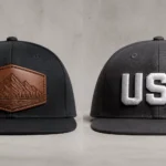
We know that navigating the world of custom apparel can feel a bit overwhelming, but that’s why we’re here! Whether you need custom caps to match your new tees or you want to explore the world of laser-etched promotional gear, we’ve got your back.
Ready to make your mark without becoming a cautionary tale?
- Send us your logo and let’s see what we can do!
- Contact our team today to start your custom project.
- Find the perfect style for your brand in our latest collection.
- Make an impact with gear your staff will actually want to wear.